
Brand Identity for conceptual beverage brand Fresea
CLIENT: Fresea
SERVICES: Packaging, Typography, Logo design
As part of the Green-Design 2022 campaign, we developed the brand identity for Fresea, a beverage set in a dystopian future where marine life has disappeared. By featuring artificial sea-inspired flavors, Fresea offers a unique and thought-provoking taste, evoking a future where the ocean’s bounty is only a memory.


Inspired by the rugged coastal rocks and cliffs, the type for Fresea reflects a dystopian world, capturing the passage of time

To highlight the mechanical nature of the font, we used fixed proportions and consistent line thickness, mimicking the look of stacked stones

By adding irregular slants at the joints where the lines bend, we captured the rough texture and unevenness of the stones


Simple shapes were used as references for AI to study compositions, with each element carefully defined by individual hex codes

Objects were matched to the created compositions, with custom style values for light and atmosphere specified through prompts to ensure consistency

Final prompts and source images were developed through a process of trial and error with reference images, refining the visual direction

Final images refined in Photoshop for further adjustments.
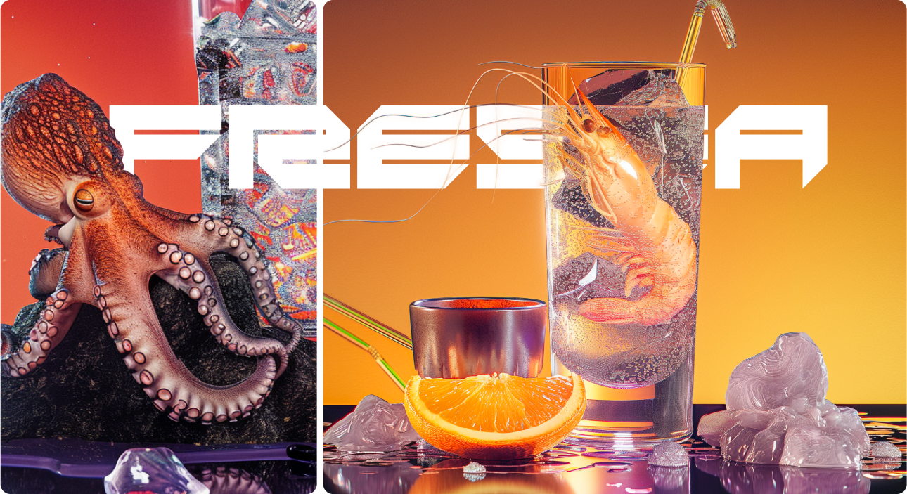

In a future where sea life has vanished, Fresea imagines a synthetic beverage brand reviving extinct flavors through lab-grown memory.The packaging borrows from biotech and Y2K aesthetics, featuring an enlarged octopus tentacle as a texture—both visceral and clinical. “Contains 1.2% real octopus extract” is printed unapologetically, hinting at a world where nostalgia is manufactured and consumed.
Typography mimics the logic of machines rather than human touch. Every element—from the sterile nutrition label to the distorted type—suggests a system trying to simulate life, not preserve it.Fresea doesn’t sell freshness. It sells fiction, packaged for the end of nature.


