
Rebranding Membership Based Food Market in Beijing
CLIENT: FUDI
SERVICES:
Fudi is a membership-based retail wholesaler that has gained popularity among Chinese consumers seeking affordable and sustainable food options. In 2021, we conducted comprehensive consumer research, developed a core messaging strategy, and created key visuals to position Fudi as a modern, community-driven alternative to traditional supermarkets. Our branding efforts aimed to attract young, eco-conscious individuals interested in affordable and sustainable food sources.
Style
The logo is designed to embody autonomy and joy, reflecting the values and lifestyle of Fudi’s primary target audience.
Localization
Each location features a unique logo that integrates the regional name between the 'Fudi' brand and the smile line, maintaining brand consistency while embracing local identity.
Scalability
The design includes a smile line added to the "fudi" text logo, allowing it to be easily recognized across languages and cultures.


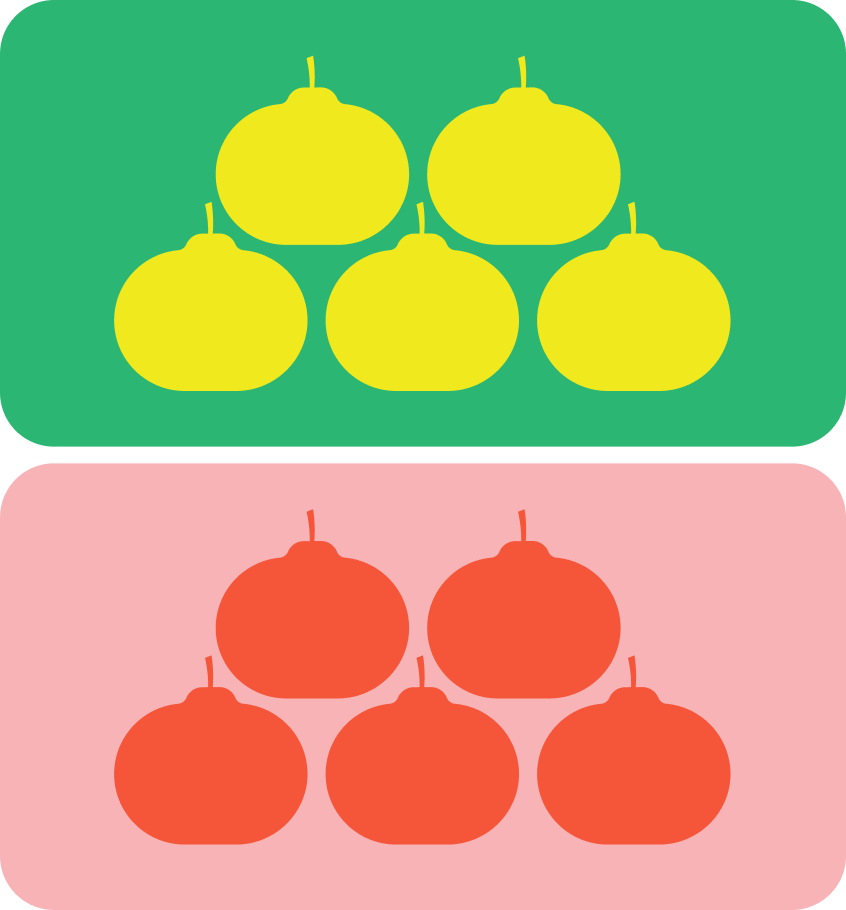
The color palette for Fudi draws inspiration from the diverse range of fresh seasonal produce they offer. Building on this idea, we developed a seasonal color guide tailored for holidays and local Chinese celebrations. This approach ensures visual consistency while allowing for creative exploration and adaptability.


Style
The logo is designed to embody autonomy and joy, reflecting the values and lifestyle of Fudi’s primary target audience.
Localization
Each location features a unique logo that integrates the regional name between the 'Fudi' brand and the smile line, maintaining brand consistency while embracing local identity.

Scalability
The design includes a smile line added to the "fudi" text logo, allowing it to be easily recognized across languages and cultures.


